
EVOSS Graphic User Interface
Challenge
Tevosol was in the early stages of developing EVOSS (Ex-Vivo Organ Support System), a portable warm perfusion machine to facilitate the resuscitation, transportation, and evaluation of donor organs. Having already designed both the brands and visual identities for their company and product, I was approached to assist in establishing the visual style for the graphic user interface (GUI) of the EVOSS display touchscreen. A detail frequently overlooked in the medical device industry, Tevosol wanted their device’s GUI to reflect the visual vocabulary of the parent brand.
At a high level, two types of icons were required: a set to communicate meaning and a set to convey function. Particularly challenging was the volume of assets for which this study would need to account—more than 80 total icons. Additionally, the overall wireframes and graphic styles needed to accommodate users moving between procedures and primary and secondary EVOSS functions.
Solution
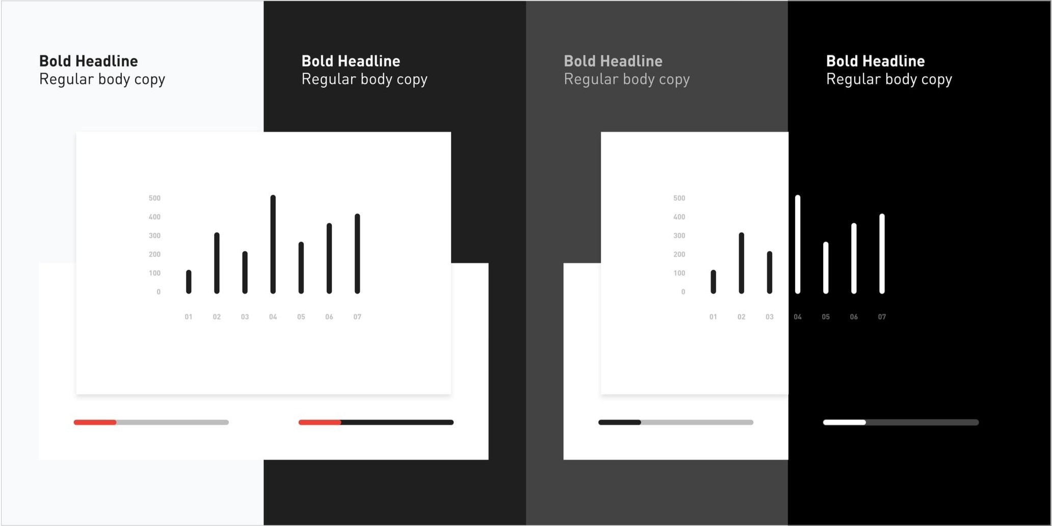
I recognized the need to balance the visual legibility of the interface’s design with the client’s request to retain brand continuity with the visual identity. I began by defining a high-contrast, monochromatic color palette, ranging from black to white with complimenting light and dark gray tones. This approach was in keeping with the appearance of the device itself, being designed by Formation Design Group. The result would be an interface that felt incorporated into the machine.
Typographically, I proposed a limited use of text, choosing to emphasize only the necessary data critical to medical technicians using the touchpad. Paired with a high-contrast palette, the result was a system that presented and reinforced a clear hierarchy of information.
Next, I utilized a grid structure to guide the designing of the icons. This framework allowed me to create a set of unique illustrations while maintaining visual consistency across the family. Stylistically, I wanted to retain the broken-line, rounded-end treatment established in the organ icons and typemarks to maintain a common graphic language.
My role: Account Services, Strategy, Creative Direction, Design


The underlying grid allowed me to create a consistent set of icons, providing a unified look that reflected the visual style of the master brand. As new icons were added, the grid served as the common framework to ensure uniformity.
The interface and icons look great! It successfully ties everything together quite nicely.
—
Russell Kroll, Founding Partner of Formation Design Group


I created a set of visual styles to define the character of the elements and guide the overall design. The intent was to stay true to the visual language established in the master brand and pull that aesthetic through to the graphic user interface.

Completed at +Intention
Creative Direction and Design: Terry Lawrence