
EVOSS
Challenge
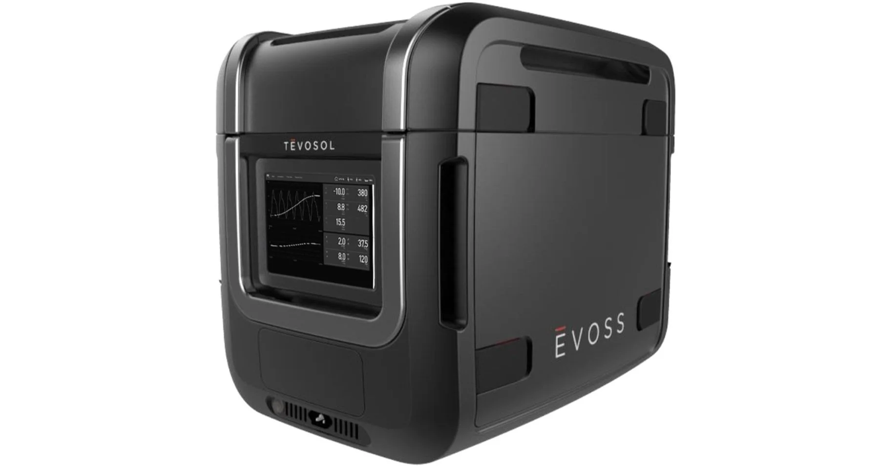
Tevosol, a medical device company, was developing a first-of-its-kind portable warm perfusion machine to facilitate the resuscitation, transportation, and evaluation of donor organs. Plans consisted of four device platforms to account for four organ types: lung, heart, kidney, and liver. The first device, focusing on lungs, was preparing for its trial phase; the additional machines were still in early concept and development stages.
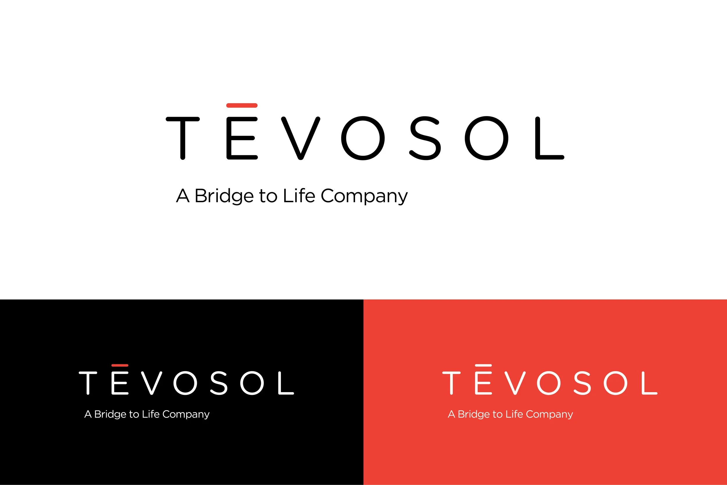
Having already created the brand and visual identity for their company, Tevosol asked to extend that visual system to their family of devices. While they didn't have rigid mandates driving the approach to the project, they stated the desire for the product brand to work together with the Tevosol brand. Still a new company, reinforcing the parent brand was an important consideration.
Solution
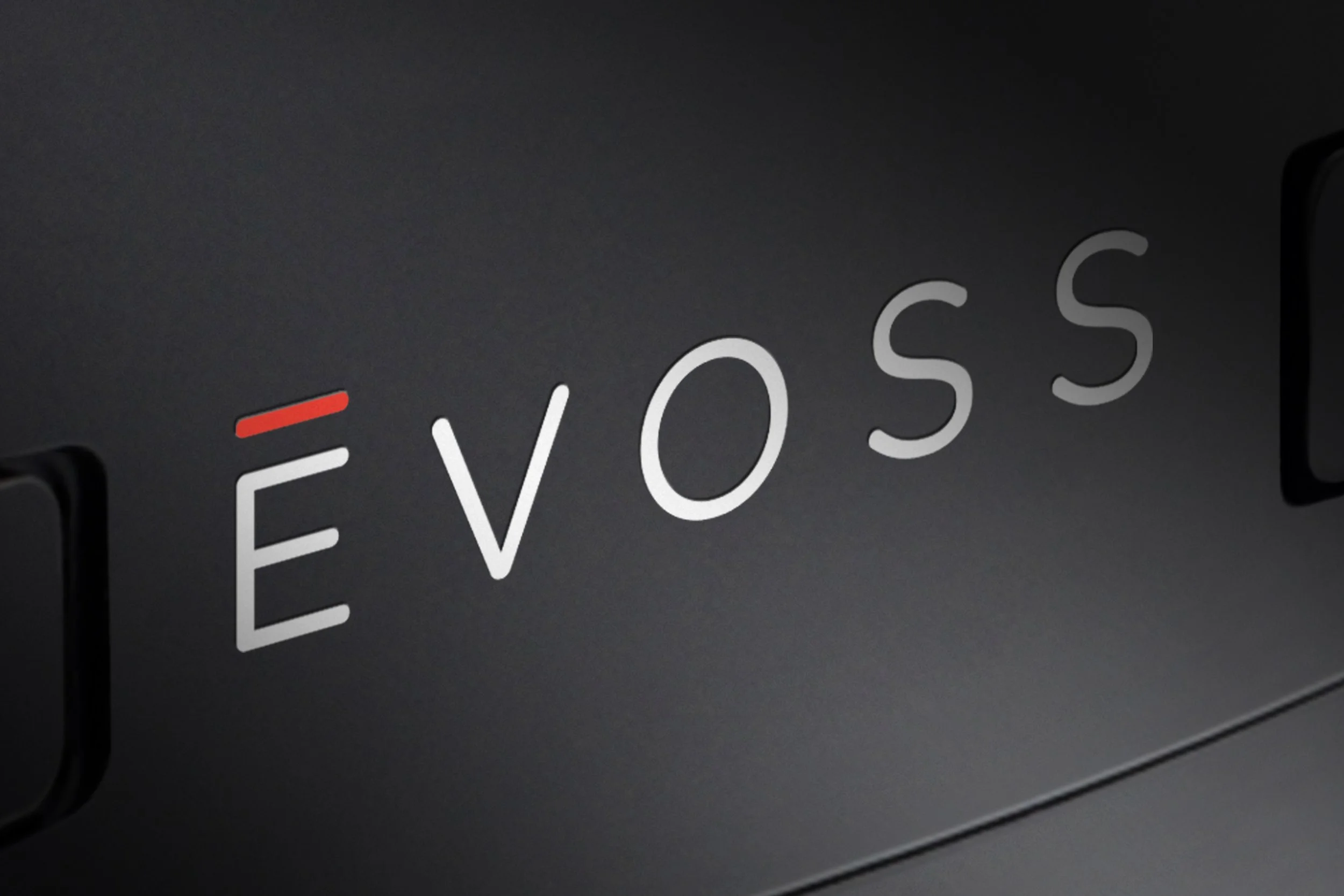
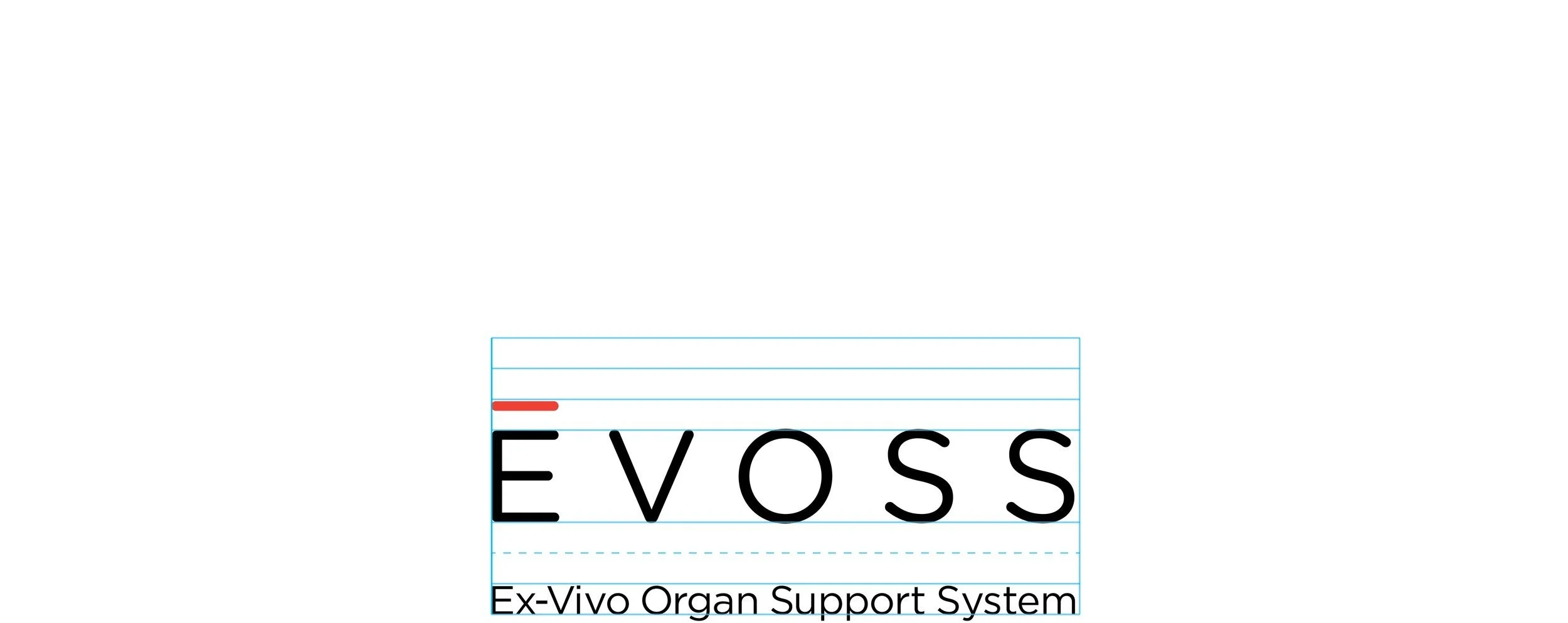
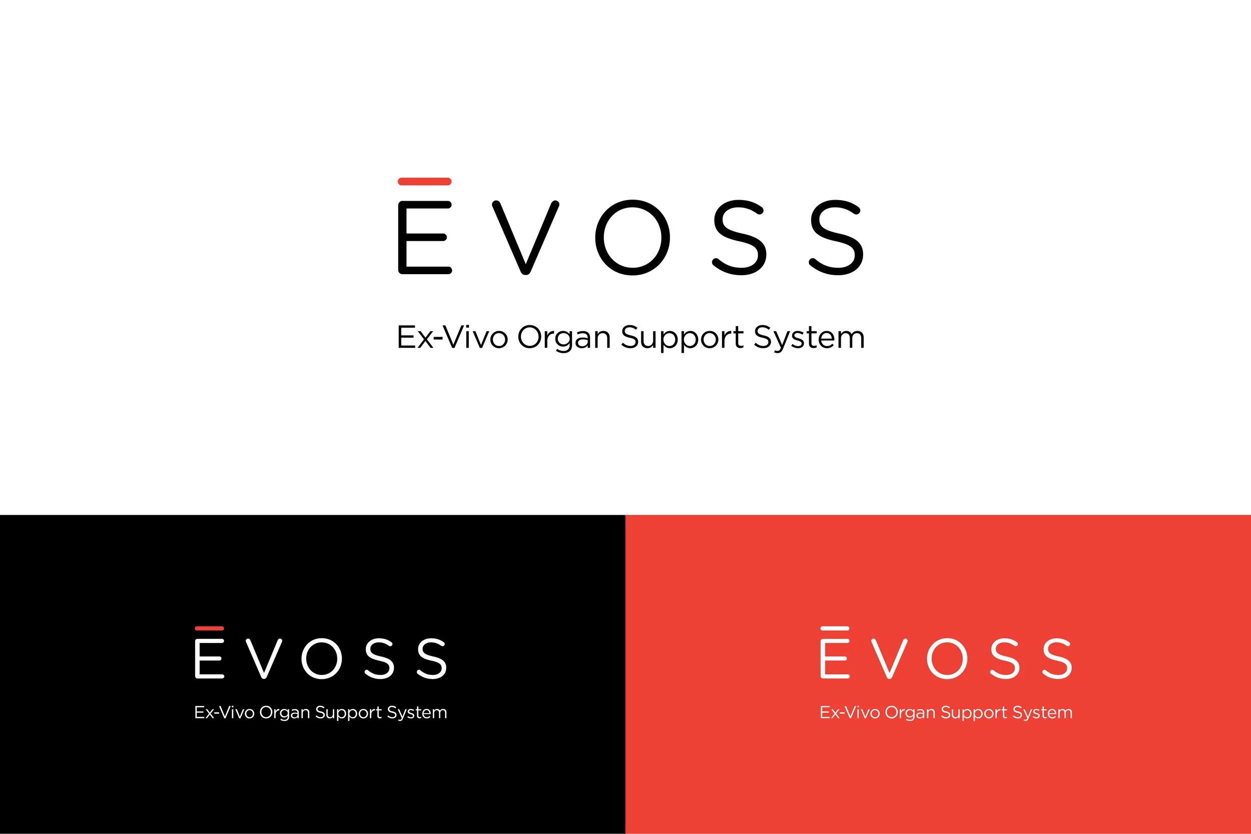
I began by helping our client determine a name for the product brand that leveraged the phonetic characteristics of the parent brand’s name and the visual qualities of its logotype’s letterforms—EVOSS (Ex-Vivo Organ Support System). By doing so, it set the stage for uniformity across the group of visual identities.
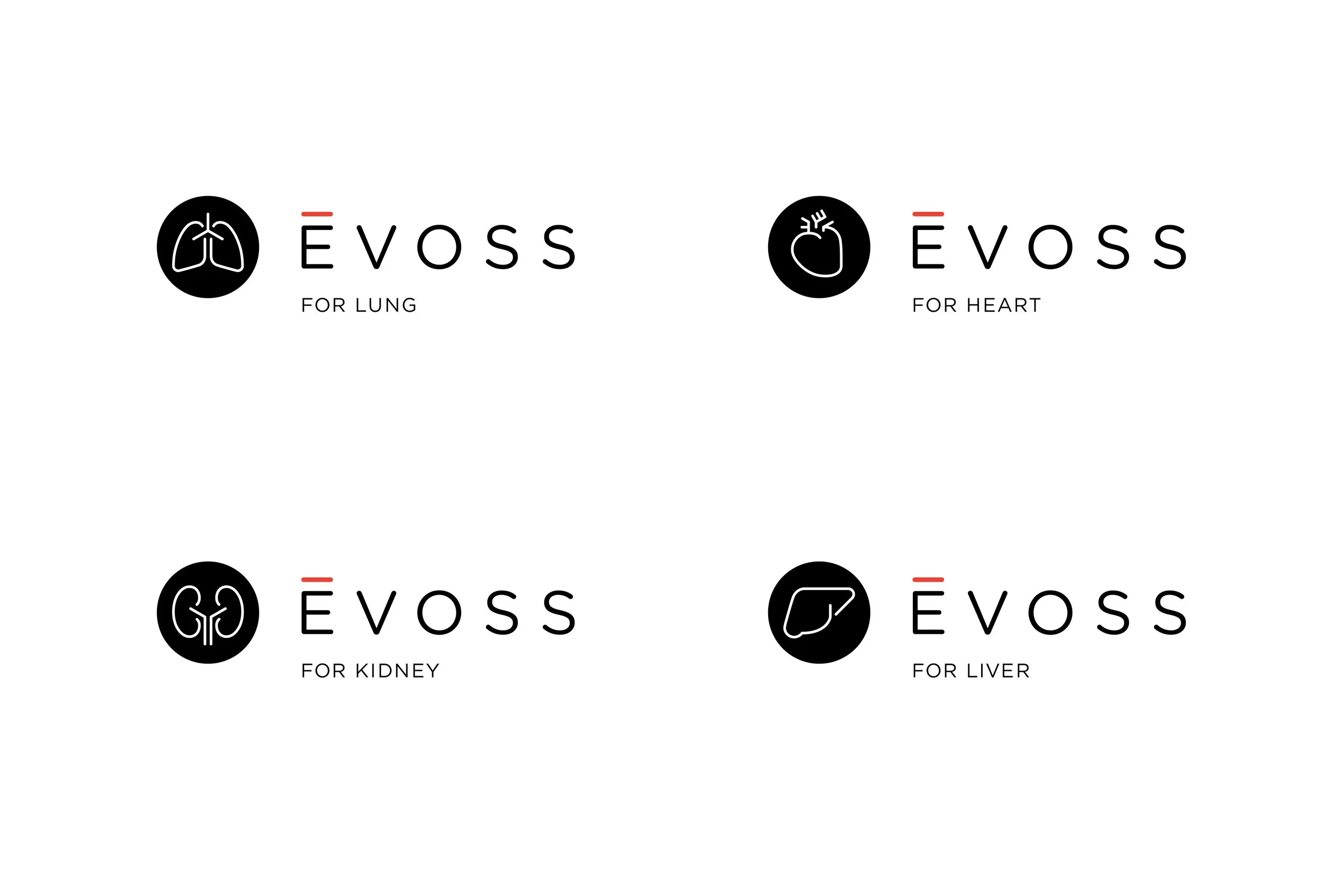
While each EVOSS perfusion machine itself would inevitably exhibit certain unique design differences suited for each organ, their overall visual identities needed to work together as a system. I started by designing the EVOSS typemark to pair with the Tevosol typemark. Next, I established a structure to ensure visual consistency and typographic hierarchy across all subbrand names and descriptors. Lastly, I incorporated a family of supporting logomarks related to each organ to accompany the typemarks. The illustration style followed the style established earlier in the development of the Tevosol visual identity. As for the descriptor line, I included the word “FOR” before each organ name, both to indicate the organ associated with each device and to plant the idea that these machines function as hosts and advocates for the organs themselves. The result was a unified system that could extend over time.
My role: Account Services, Strategy, Creative Direction, Design, Copywriting
Terry’s actually on a search for something that isn’t in the conversation. It’s not just a process. He has the end in mind, and he’s not going to stop until he gets to the end. He does that in a way that others don’t.
—
Ron Mills, CEO of Tevosol


Completed at +Intention
Creative Direction and Design: Terry Lawrence
Copywriting: Terry Lawrence